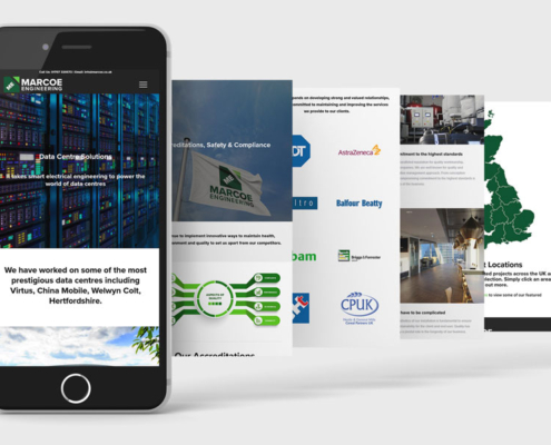
Your website is the most effective tool you can use to tell your customers who you are and what you can offer.
It’s a hub of all the important information you need to convey to your target audience, like a one-stop resource for all things related to your company. And if it is well-designed with your audience in mind, you can expect them to keep coming back for more.
Making your website stand out is the core of web design. By combining elements from different art styles with the content of your web page, web design seeks to harmoniously present information about your company in an attractive and appealing way. When customers like what they see, they tend to spend more time on it, which means more traffic for your website.
Here are some things to consider for your website design:
Design For Your Demographic
If you’re a party planning company whose clientele consists mostly of children, then having a website with muted colours and stock imagery won’t do you any favours.
A website’s design communicates the personality of a business while simultaneously indicating its target audience. If you’re a waxing salon that caters mostly to young women, then soft colours with playful fonts and elements are likely to draw them to your establishment. If you’re a luxurious furniture store that sells furniture to the well-groomed individuals of upper echelons, then classic fonts and neutral hues will tell your customers just how high class and well made your products are.
Play With Patterns
You may find yourself wanting to stand out from your competitors’ website design but they tend to use shapes or logos that are closely related to your industry—which means you have the same elements on your website too.
Circumvent this by employing a theme that evokes the essence or feeling of your service. If you’re a company that primarily sells board games, then use vibrant colours, patterns or elements of pop art that encompass the joy and social nature of your product. If your company sells vases, perhaps the minimalist art style will help remind your customers that a simply designed container is all they need to spruce up their space.
Harmonise Design With Art
Some people argue that design is primarily used to convey information and is integral in a user’s website experience and navigation, but art is used to make things more visually appealing. Your website can easily combine both by using artistic elements to show your company’s personality and website design by integrating these into important information. Your website should be a place that customers revisit to appreciate its aesthetics while also valuing the content it publishes.
Bottom line
Design at its core focuses on function over form, while art focuses on the latter. It’s completely possible to meld the two and create a unique website that is replete with necessary information while making it engaging and fun. Ultimately, your website can make or break a potential relationship with your customer, so it’s important to make sure your website resonates with your audience!
Lemongrass Media is a web design agency with offices in Hertfordshire and Buckinghamshire. We build beautiful websites for our customers that are easy to use and simple to manage. If you think your website could use a facelift, get in touch with us today!
 https://lemongrassmedia.co.uk/wp-content/uploads/2023/03/website-brief.webp
600
800
Steve Telford
https://lemongrassmedia.co.uk/wp-content/uploads/2020/10/logo-lgm.png
Steve Telford2023-03-29 16:52:202023-03-29 16:55:41How to create a website design brief for your business


