Just recently, we have seen Google scrapping non-responsive sites from their search engine. As expected, this has led to multitudes of sites scrambling to adjust their now-obsolete design.
What has affected the majority has also affected the smaller regions, particularly, school web design. We may have seen a global shift from static to responsive sites, but the design trends of the previous years have continued to flourish, improve and branch out. Parallax and vertical scrolling have taken school websites by storm, replacing that above-the-fold-postcard-look-and-feel. Hero videos replaced still photos. But apparently, there’s still room for growth.
This is what to expect for school web design trends for 2016:
Grid Layouts
Panel design was a popular trend in 2015 but Grid layouts are set to overtake it.
In order for a site to be inherently responsive and work on multiple devices, designers use a grid system that allows elements to be rearranged and re-sized in a particular format depending on the screen size. However, it also leads to sites that follow a similar, predictable pattern of stacking, resulting in many sites having a similar look and feel.
This predictability is good and bad at the same time. It’s good because you can provide an experience that website users are used to, so they’ll be able to easily navigate your website. It’s bad because there’s not much room for originality. In 2016, we will be seeing a break from this in a few different ways.
First, we’ll begin to use visuals that break from stacking and use effects of hover or rollover states to create that interactive experience. For example, Roundwood Park’s frontpage. The top section features snippets of the site’s major pages. You see only a part of the image peeking at first but when you hover over it, more text is shown and the whole image is displayed.

Second, we’ll see more elements being loaded in the same space. This means we’ll see clickable filters to display the intended elements without having to show all of the elements, thus decreasing scrolling. An example would be, De Havilland’s fun space page. You only need to click relevant filters in order to see what they contain – all in the same space and adjusted to fit your screen.

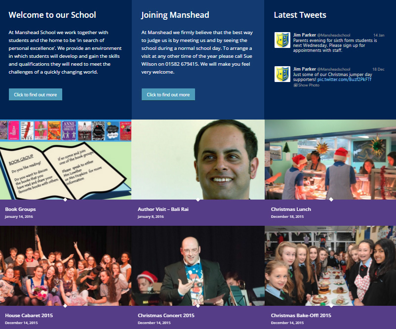
And third, we’ll see grids transform into modular layouts. This type of design maximizes the potential of grids by adding more content, images, and video to a single panel for a more visual experience. An example would be the center section of Manhead School’s frontpage. Here you can see page excerpts, featured posts, and even the latest tweets from their Twitter account.

Typography
Typography has always been inherent to any part of design no matter the media. Without typography and it’s correct use, no design will ever be elevated.
From readability to creativity, the fonts you choose for your logo, headers, and accents play a huge role in crafting a website experience. With the growing importance on multimedia for storytelling, 2016 school websites are going to have a greater focus on the types of fonts they choose.
Rather than just selecting paragraph and header text, school websites should have different fonts for:
- Headers
- Calls to Action
- Paragraph Text
- Accents
The variations are critical in providing a richer experience and displaying relevant content. Include fonts with varying styles, weights and families of type faces. Fonts like these are often offered by Google, Adobe and other resources.
Cinematic Elements
Movement has always been a great way to grab a website visitor’s attention or convey emotion. Unlike current background video trends, cinematic elements are meant to enhance the feeling of a site without killing bandwidth or distracting from the overall message with small elements of movement, such as clouds moving in the background instead of a full feature video playing in the background or area of a site. An example of this would be Roundwood Primary’s header:

Less Text, More Visual Storytelling
Telling a story on the web is a massive undertaking, and applying that to web design can even be more daunting. It takes a certain art to tell a story and draw a user in without making them feel overwhelmed.
Flat and semi-flat designs
Flat designs were huge in 2015 as schools made the shift to look sleeker and modern. We will continue to see the use of flat design in 2016.
We are going to see the reintroduction of shadows while maintaining the overall flat design look.
One of the biggest limits of flat design was its inability to have depth. With adding a shadow effect back into the mix, designers can now create depth and help guide users in a way that flat design couldn’t.
Editorial-Style Design
We are no longer going to be seeing any more boasting of brands and goods on the frontpage, in fact, we are gonna let stories take the stage. There’s not much cause to be hesitant here as this technique is known to work. Not only that, you’ll love it for school websites because of the role it plays in communicating value, telling a story, and sharing recent news and events. It’s great for mobile, too, since the user only has to scroll down to know the full gist of what your school is all about. Having a great story also proves that you have an active community, and lets your school’s brand be communicated by something other than mission statements.
In conclusion, we are going to be seeing a greater focus on design that’s more responsive. Websites that are built to adjust on desktop, tablet and mobile. For 2016, school web design trends are set to continue maximizing the potential of grids, fonts, flat design and visual story-telling to delight and enthrall site visitors.
 https://lemongrassmedia.co.uk/wp-content/uploads/2025/01/7-Essential-Elements-of-School-Website-Design-in-2025.1.jpg
600
800
Steve Telford
https://lemongrassmedia.co.uk/wp-content/uploads/2020/10/logo-lgm.png
Steve Telford2025-01-06 11:00:002025-01-02 16:48:277 Essential Elements of School Website Design in 2025


