 https://lemongrassmedia.co.uk/wp-content/uploads/2026/04/Why-Most-Corporate-Website-Projects-Fail-FE.webp
600
800
Steve Telford
https://lemongrassmedia.co.uk/wp-content/uploads/2020/10/logo-lgm.png
Steve Telford2026-04-30 12:35:332026-04-30 15:38:12Why Most Corporate Website Projects Fail
https://lemongrassmedia.co.uk/wp-content/uploads/2026/04/Why-Most-Corporate-Website-Projects-Fail-FE.webp
600
800
Steve Telford
https://lemongrassmedia.co.uk/wp-content/uploads/2020/10/logo-lgm.png
Steve Telford2026-04-30 12:35:332026-04-30 15:38:12Why Most Corporate Website Projects FailIt’s always best practice to target your design on the right market or your intended audience when designing your website rather than just concentrating on a website that will impress your client. While this may sound contradictory, it’s the most sensible approach.
When focus shifts more towards impressing the client, the project can quickly stray away from the primary goal of the site. Whether the school is focusing on increasing inquiries, or improving the user experience for prospective and existing families, it should always be at the forefront of the design process. As a professional design agency, it’s our job to keep our schools on track to help them meet their goals.
It goes without saying that a harmonious environment is still needed and working closely with our clients is still critical in achieving a successful result.
Determine Who Your Audience Is
Competition can sometimes cause clients to forget the original purpose of their website and push them towards a particular feature or design without taking into consideration demographics of the site or their original goals — on the grounds of something that “looks cool.”
To keep the focus on the end product from start to end, here’s a few quick tips:
1. Identify the core audience(s).
It could be one primary or it could have several. Without having a definitive audience, your website will lack a main target and it will not have the primary direction needed to be successful.
2. Design for the audience(s). Remember, whilst you are the client and it is your website, you are not the target audience. Choices should be made based on meeting the goal of the website and what benefits the audience.
If your main audience, for example, are parents start by making the following design decisions:
- Less animation and special effects
- Clean and simple navigation and layouts
- Type faces that are slight slightly larger and are easier to read on different screen sizes
- Substantially-sized, colorful images
We should be seeing more of a focus on the parents in a primary school as it is mainly parents who actively seek enrollment. For example, De Havilland Primary School’s simple yet modern layout helps prospective and current parents find exactly what they’re looking for with ease.

Roundwood Primary School, on the other hand, displays what they offer at the get-go with a simple bullet list of features and key information in simple, bold letters on the side.

However, if you were to design for a younger audience, you might have a site with the following design elements:
- Lots of animation and extensive use of colors
- Complex layouts and navigation options
- Minimal text for bold headlines
- Icons or images instead of text
- More white space between areas
De Havilland School’s Fun Space page is the perfect example of design that’s appealing to a younger audience. It has a full set of fun animations, bold color, interactive elements, and an overall modern design. The page is clearly designed for it’s intended audience.

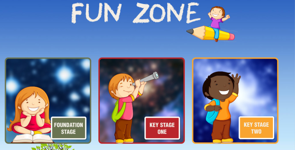
Another example would be Roundwood Primary School’s Fun Zone. The page uses simply drawn illustrations combined with colorful and playful backgrounds.

Design For Your Audience
A lot of school websites need to support multiple audiences such as parents, students, and staff. As you’re starting to plan for your own school’s website, you would want to make sure that there’s focus on features and information that will improve your intended audiences’ overall user experience and not cyou keep the focus on information and features that are going to greatly improve the overall user experience for the intended audiences, and not concentrate on ones that won’t.
Thus, it’s essential to make sure your audience is clearly defined and your goals are set by:
- Providing an unmatched user experience for prospective students
- Making news and calendars more easily accessible for parents
- Creating a new, more visually appealing directory for staff
- Bringing the sporting community to the forefront for students
Conclusion
It’s very simple to get hung up on hover features, cool designs, and scrolling effects which of course makes your school look amazing online. But we tread extra carefully around these features to ensure they become a part of the intended audience’s experience, rather than draw away from it.
Designing for a target audience is not always easy and can produce various results and challenges. One of the most important things to remember is to make sure that the correct decisions are made when designing for the intended audience as this can have a long-term effect on your site’s success.
In conclusion, you’ll end up with a site that not only looks amazing and is helpful to the people using it, it’s also a site that matches the goals of your client.
Do you want help with your school’s website design? Contact us on 0800 690 6250 or [email protected]


